A fresh and hippie identity for a fashion brand that irradiates good vibes.
A brand that taps into both sensory and emotional layers. Its visual universe blends dynamic curves, rich color contrasts, and an aesthetic that communicates freedom with purpose.
LOGO DESIGN, VISUAL IDENTITY, ILLUSTRATION, PACKAGING
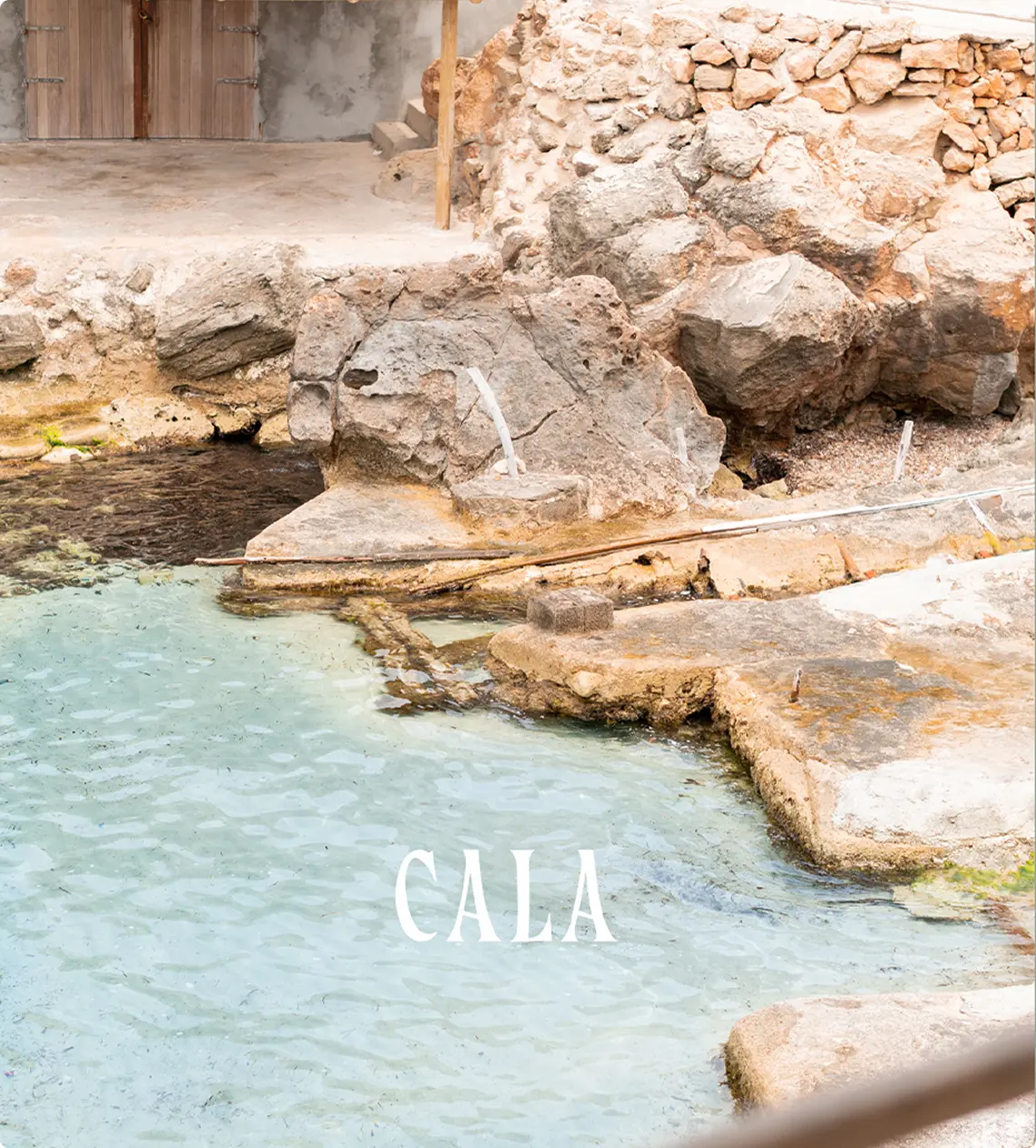
Cala takes it’s influence from the amazing island of Ibiza. The island holds a strange energy, it ́s vibrant and cautivant magnetism reflects in the spirit of this young brand.
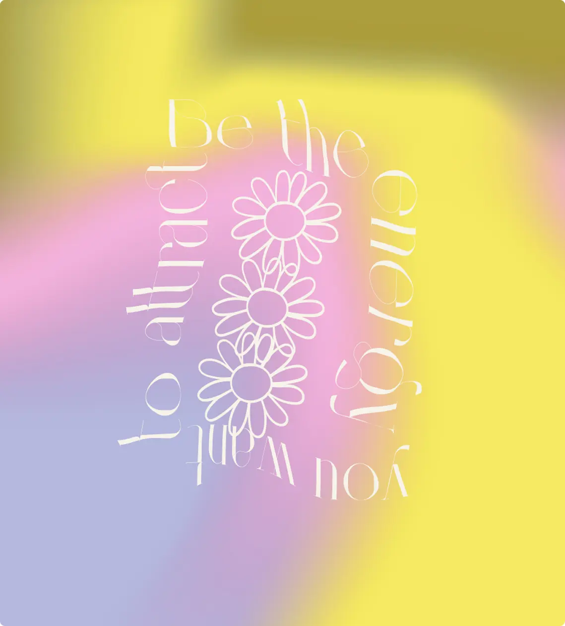
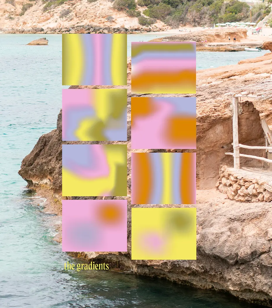
The wavy effect, the elegant typography the fluid subtlety give life and bright up the essence of Cala.
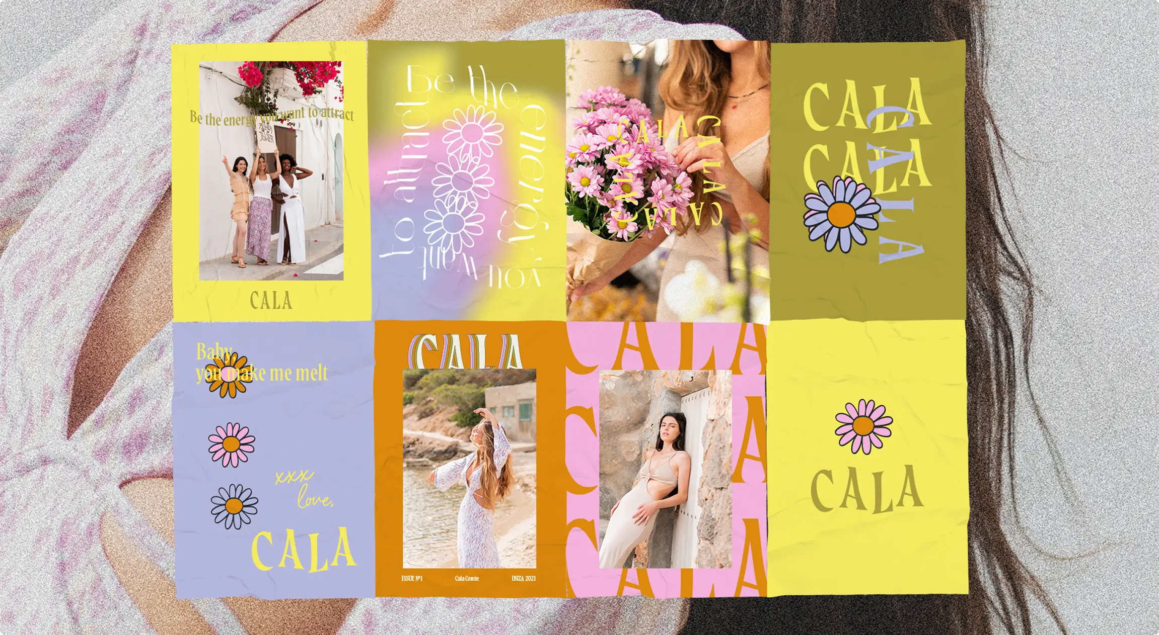
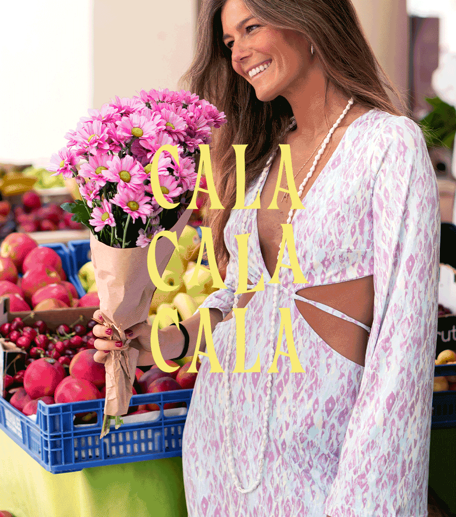
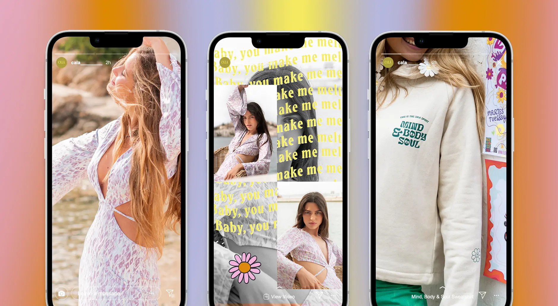
Made for girls who want to spread joy,-developing a bold but soft style combining sexy cuts, pastel and earthy colors and hippie-chic prints for its first collection.
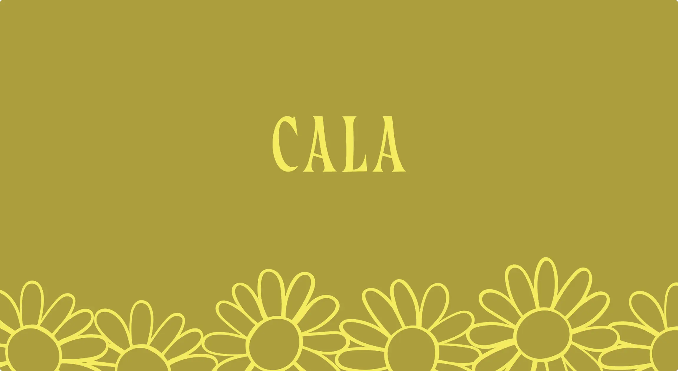
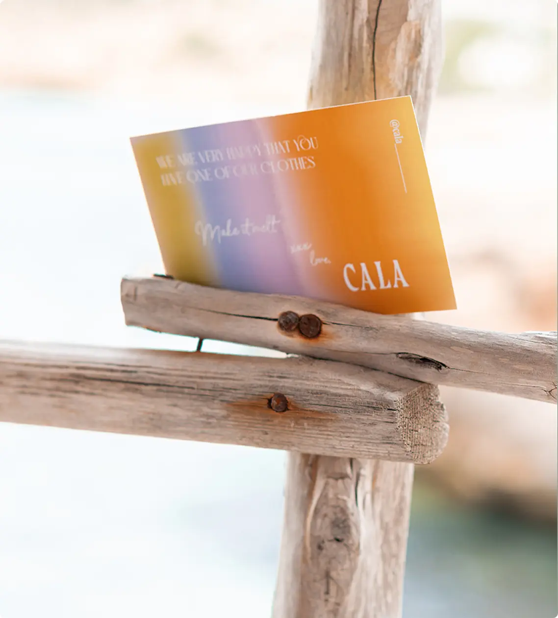
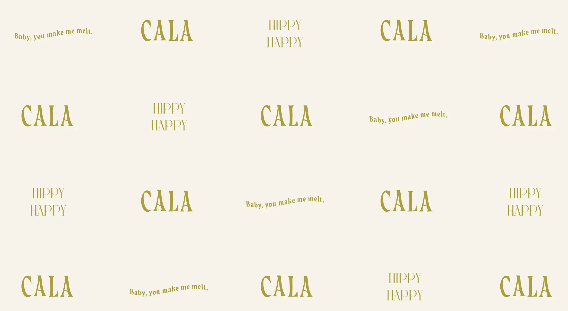
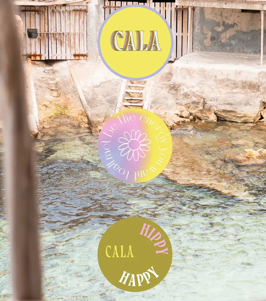
The logotype draws inspiration on vintage lettering and fluent movement of the ocean waves, serving as a visual respresentation of the essence and inspiration of this brand’s core.
The wavy, elegant lettering is a nod to Ibiza’s rhythm—the ebb and flow of the sea, the sway of the woods and trees, the movement of free-spirited souls. Designed to feel organic yet sophisticated, the typography mirrors Cala’s essence: bold but soft, confident yet fluid.
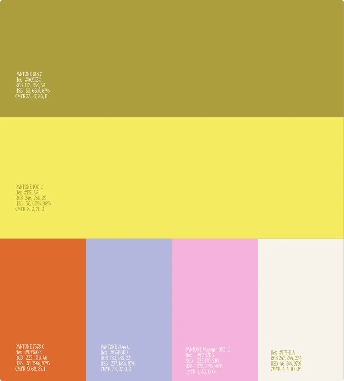
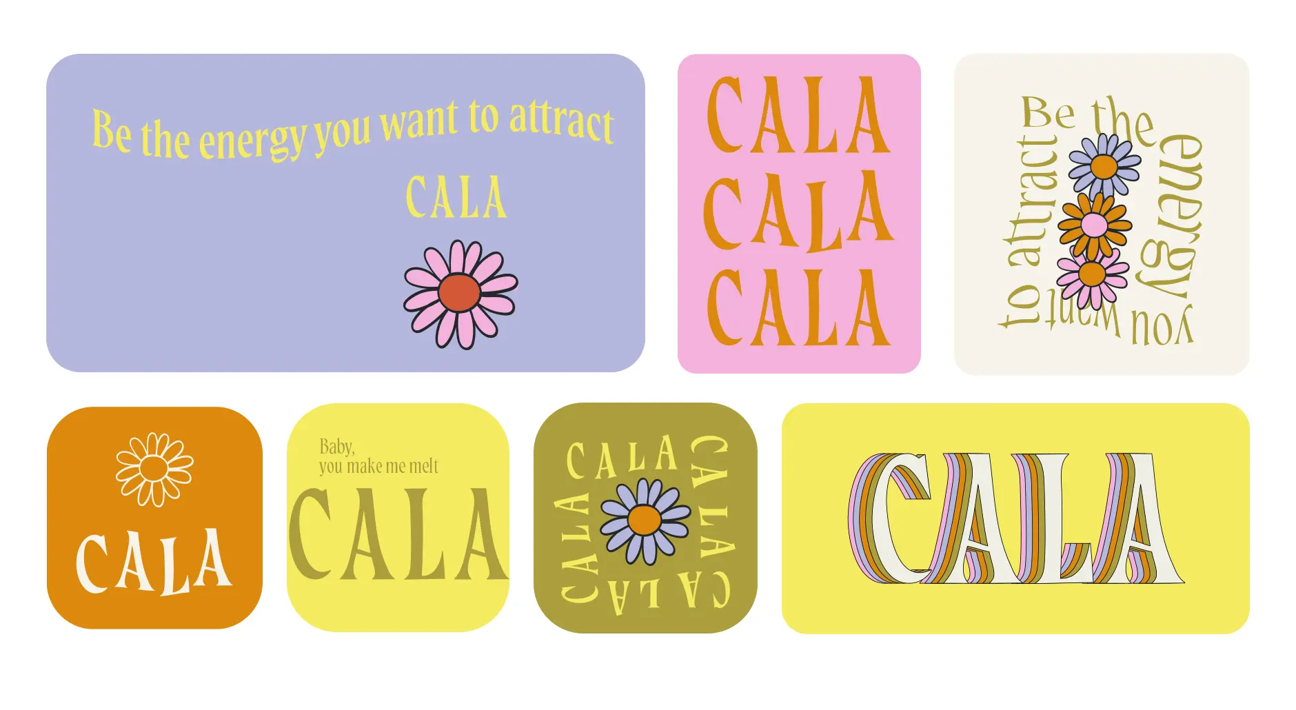
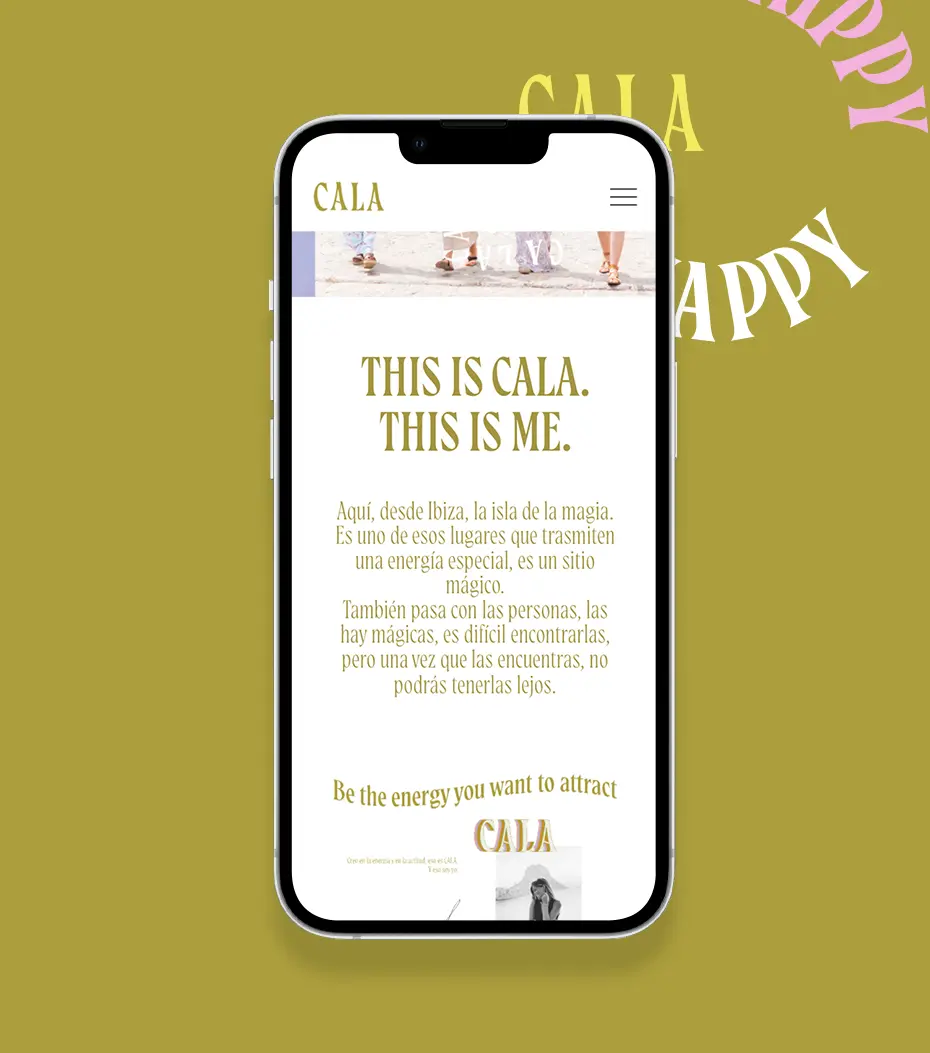
Every shade in Cala’s color palette is a tribute to the island’s soul. Pastel tones meet vibrant shades, evoking sun-kissed skin, endless waves, and colorful sunsets sunsets. The colors dance between bold and delicate, just like the Cala girl—unafraid to stand out, yet effortlessly in tune with her surroundings.
¿Hablamos?